Icons
I was asked to design a custom iconography set to ensure a consistent visual language across the Ply product and enhance the overall user experience.
Ply is a no-code platform that lets you build custom features and automation inside your existing business apps, so you can tailor workflows and add functionality without writing software. Here are different projects i worked on as a brand designer.
I was asked to design a custom iconography set to ensure a consistent visual language across the Ply product and enhance the overall user experience.

I chose a Duotone style to visually represent Ply’s core value—the ability to build and combine layers of software (modularity). intentionally utilized smooth shapes and rounded corners to create a less serious, more welcoming aesthetic, ensuring the product felt approachable and welcoming.
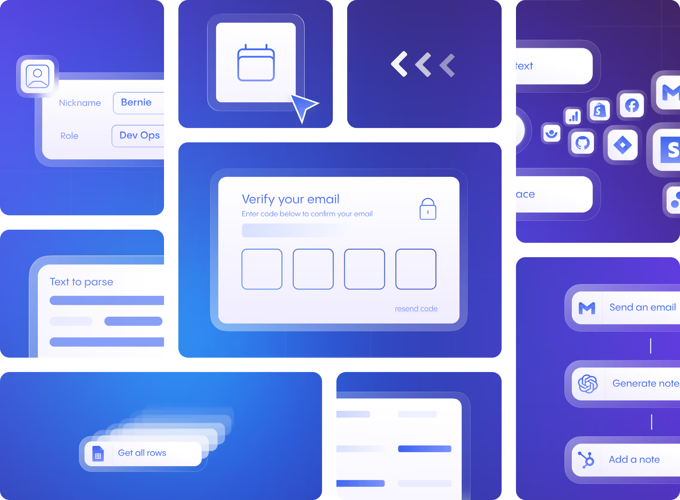
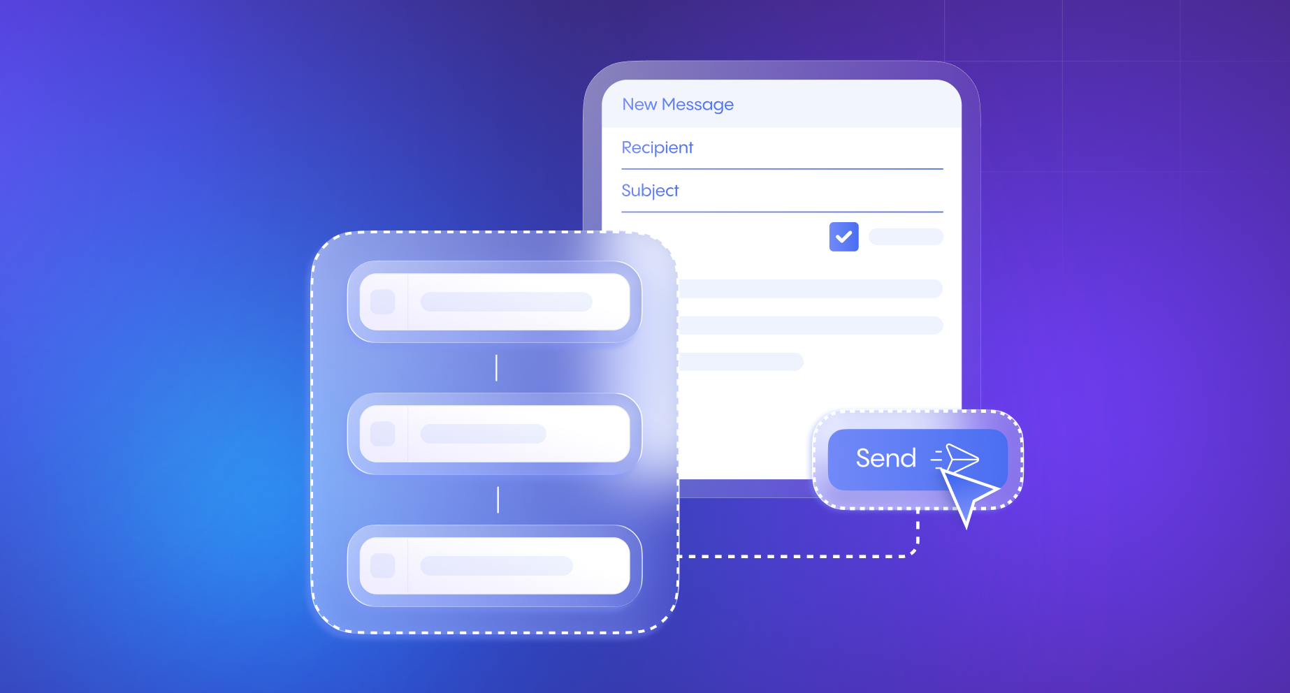
I designed the core visual assets—used across the website and marketing—to clearly articulate the platform’s primary capabilities. I chose a transparent and layered aesthetic to communicate the product's underlying function: modularity and data flow. The transparency suggests the seamless integration and complex logic working "under the hood," while the overlapping elements visually reinforce the way the platform connects various data sources and application steps together.
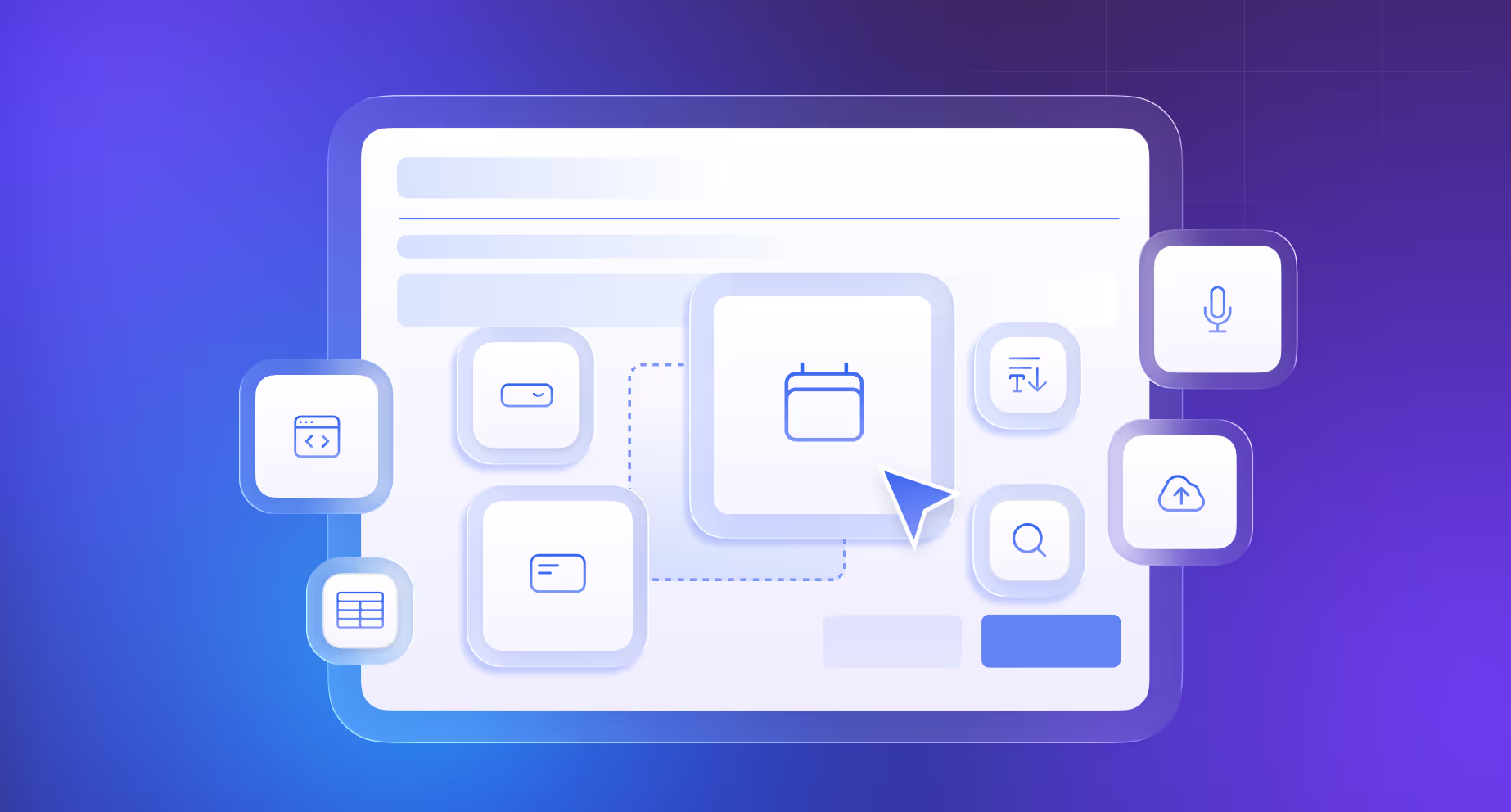
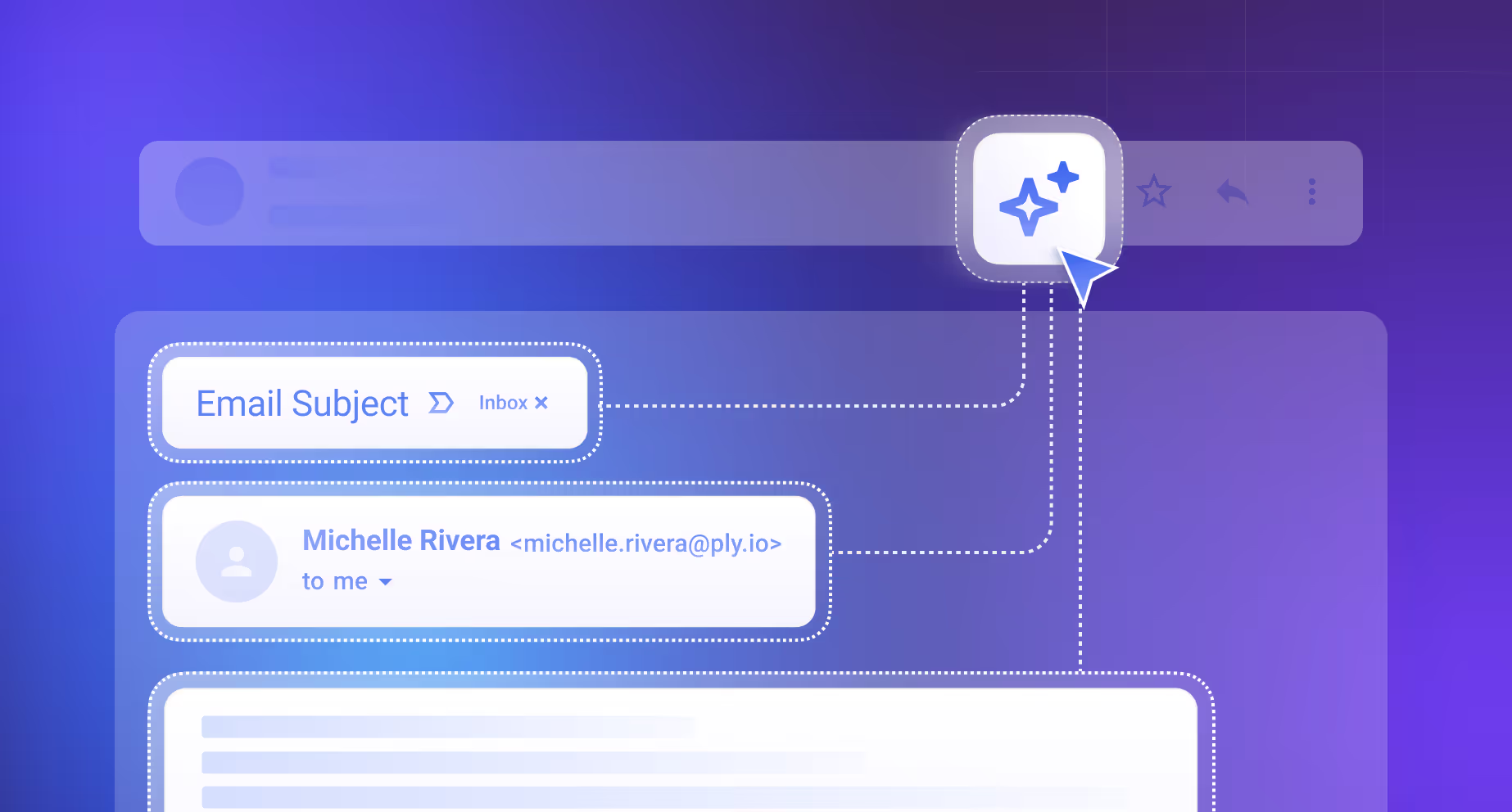
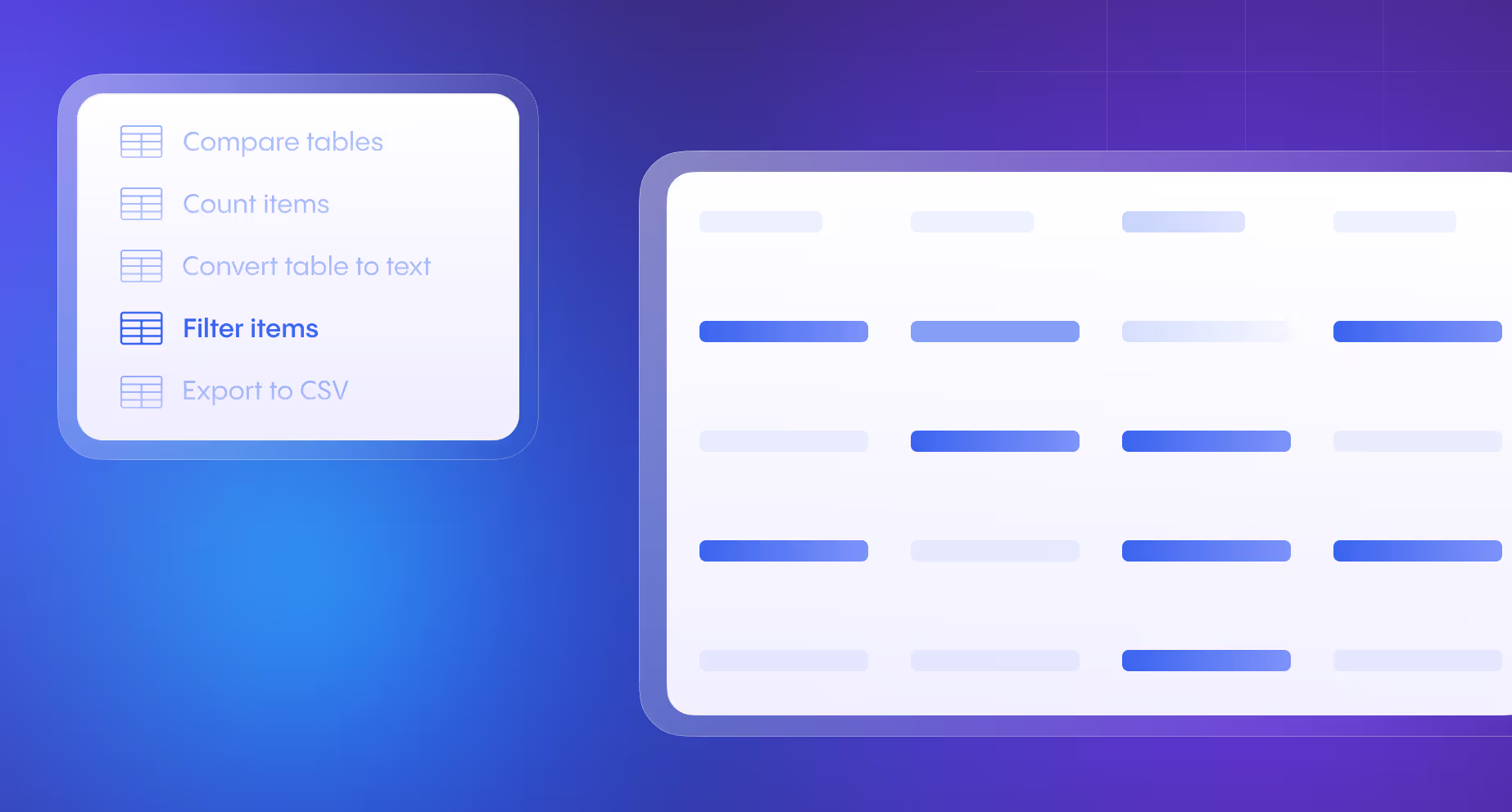

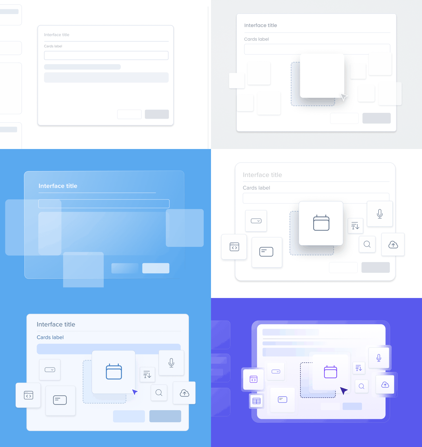
The development of the core visual language for explaining platform capabilities went through multiple stages of development and testing to find the most effective style. The primary challenge was to create a simplified UI aesthetic—stripping down unnecessary elements—while still maintaining a clear resemblance to the actual platform UI.
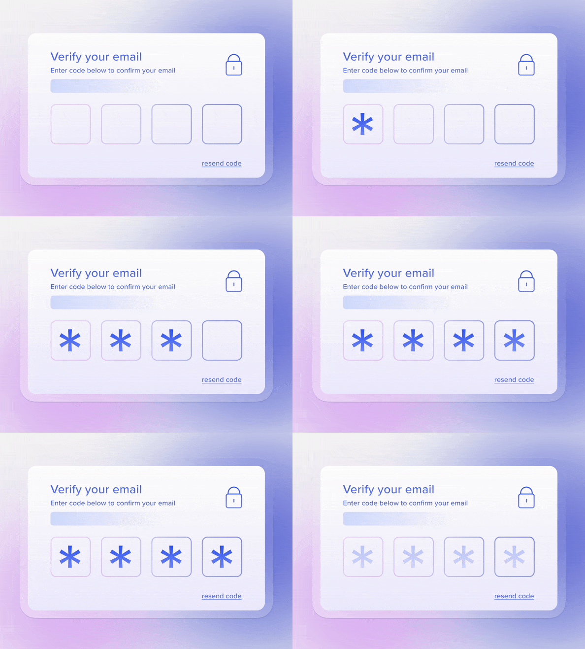
I designed motion assets for the company newsletter. This work ensured brand consistency by adapting the new system's color and style, with motion specifically used to boost engagement and clearly illustrate product announcements and feature updates.
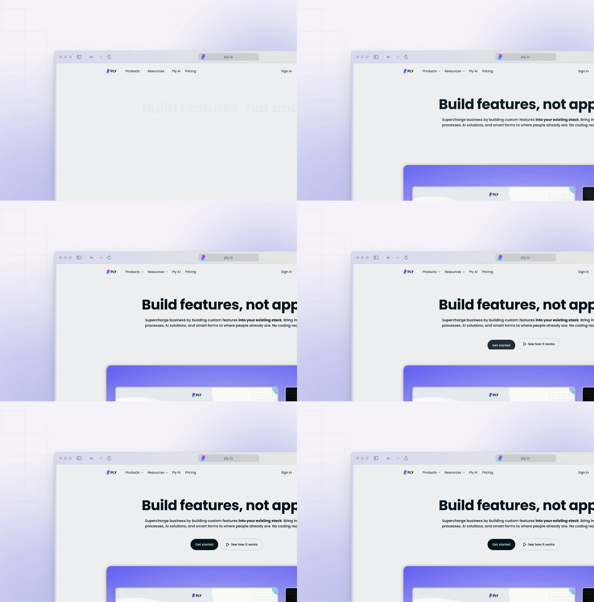
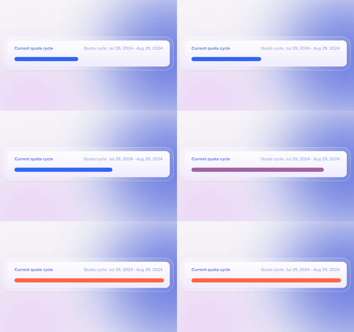
To support marketing campaigns, I designed a variety of static and animated assets for social media and Google Ads. I incorporated a distinct gradient and transparent aesthetic. This visual approach reinforced the brand's modern, sophisticated feel while using the subtle transparency to suggest layers and data flow, linking the ads visually back to the product's core capability (modularity).
This motion i designed, served as the opener for explanatory videos. This was built as a reusable template where I could quickly update the text and numbers to showcase various features. Utilizing a dynamic, vertical scroll, I created motion that visually conveyed the idea of countless possibilities and extensive platform features. The asset effectively communicated the platform's core value proposition.
To streamline user onboarding and ease the learning curve for complex features like data mapping, I designed a system of step-by-step feature animationsplaced directly within the platform's UI. These in-product videos served as a critical bridge, offering a direct visual representation of the required user action to support the instructional text.